MARBIT
Brand evolution for a growing infrastructure company
As Marbit became part of the Eleda Group, its visual communication evolved to reflect the company’s new position and continued growth.
Visual identity
COLOUR PALETTE
TYPOGRAPHY
Aa
DM Sans
ABCDEFGHIJKLMNOPQRSTUVWXYZÅÄÖ
abcdefghijklmnopqrstuvwxyzåäö
0123456789 176%
Identity in use
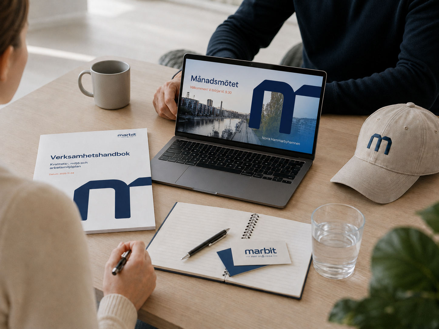
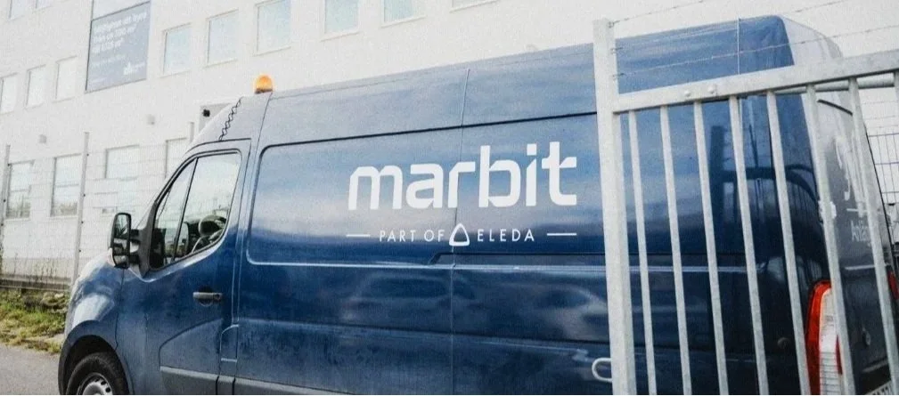
A flexible visual system developed for presentations, corporate documentation and everyday communication, creating consistency across very different types of content.
Launching the identity
from the inside out
A short launch film captured the reveal of Marbit’s new logo in the reception. Shared on social media, the film achieved strong reach and engagement.
A clearer digital presence
The website was updated with a stronger structure for services and projects, while bringing greater focus to the people, expertise and work behind the company.
Humanising Marbit on LinkedIn
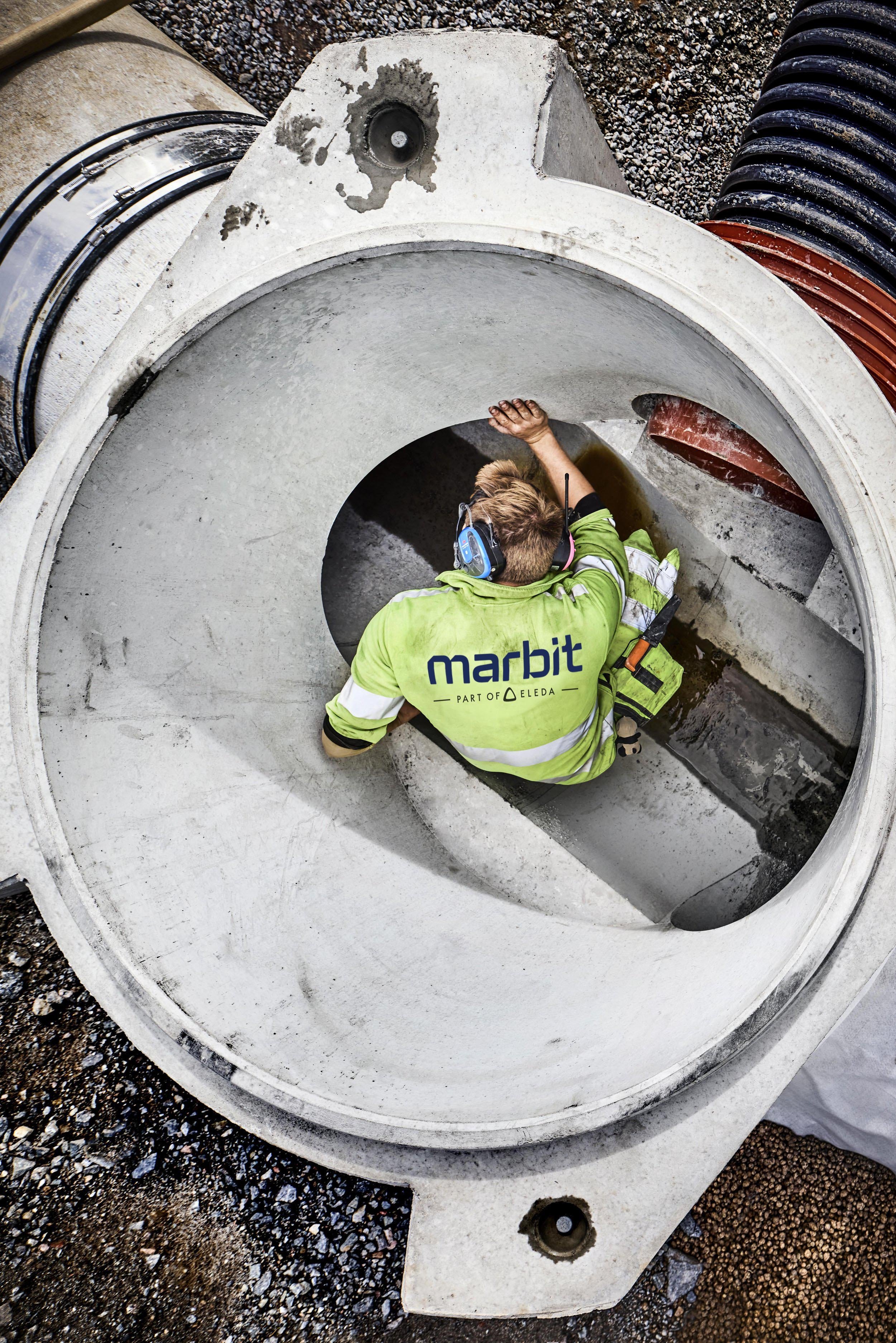
A more people-focused content direction brings employees, projects and everyday expertise into the communication.